

Gestalt Principles of Perception explain how we visually perceive and make sense of the world around us.
As designers we can use these principles to inform how design elements are placed, and how they can create meaningful groups of things.
Let’s take a look at five principles, and see how they can help design better interfaces.
Background
Gestalt psychology was established in the early twentieth century by three psychologists. They studied how humans make meaningful perceptions, and especially how we group things and create relationships in what we see around us. From these studies, a set of theoretical principles were formed, known as the Gestalt Principles of Perception.
Gestalt psychology is described as “the whole is more than the sum of its parts”.
Simply put: we appreciate and recognise objects we see as wholes, rather than seeing them as their individual parts. Consider how we recognise a bicycle, rather than a collection of handlebars, wheels, spokes, saddle, and so on...

Principle 1: Similarity
Things that are similar are perceived to be more related
than things that are dissimilar

When you see circles and squares together in the first image, how do you make sense of them? do you group them by their shape?
In the second image, do you see alternating columns of green- and grey-coloured circles? Each ‘set’ is determined by their shared colour, so what we see are circles forming ‘columns’.
Repeating certain characteristics like shape, colour, size, or orientation, allows us to communicate that elements are related to each other.
Applying the principle in real-life

Let’s look at ovoenergy.com’s Primary Navigation links: they’re all green, and set in the same font face and size. This is the only component with these characteristics, making them a distinguished set which people recognise as something clickable and consistently positioned.
Principle 2: Common Regions
Elements tend to be grouped together
if they’re located within the same enclosed region

In our first principle, we saw alternating columns of green- and grey-coloured circles. If we now enclose those circles with lines, does this change how we now group them?
Adding borders is an easy way to create separation from other surrounding elements, and thus, creating common regions.
Background colour and shapes can create the illusion of closed regions which, in the second example, influences our reading order.
Applying the principle in real life

Take a look at our Card interface component: it’s a well-defined rectangular shape with different pieces of content within it. We can use background colour to enclose and group related items.
Overusing this principle can create confusing and unnecessary clutter. Instead we can use white space to help group and separate components, as we’ll discuss next.
Principle 3: Proximity
Elements that are closer together are perceived as more related
than elements that are further apart

When elements are positioned close to one another, compared to other elements in the same space, we have a tendency to group them as a set.
In the example above, how many groups can you see from how the circles are placed? The circle’s relative closeness is a stronger grouping characteristic than their similarity of colour.
Applying the principle in real life

In this simple form, on the left we see input fields with their labels spaced consistently. It may be difficult to discern which label belongs to which input, or which groups of inputs are related to each other. Adding white space between inputs better connects a label to its corresponding input field.
Principle 4: Continuity
Elements arranged on a line or curve are perceived
to be more related than elements not on the line or curve
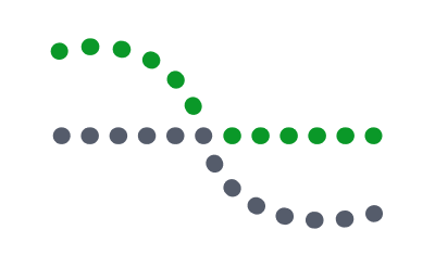
We instinctively follow a river, a natural path, or a fence line. Depending on what we’re familiar with, we tend to seek closure in what we see by moulding continuous lines or patterns.
In our example, we may distinguish a curve and a line, which appear to cross each other, instead of seeing four distinct line and curve segments that meet at a single point.
Continuation of the lines can come across stronger than the similarity of colour. The green circles in the curved line are more related to the grey circles along that same continuing curve.
Applying the principle in real life

Continuity can be used with interface components like a scrollable Blog Posts section, to suggest we should direct our attention to a specific place or direction to continue viewing content.
In the example above, each article is presented consistently until we reach the edge of the page, where one article is seemingly cut off. Designing the articles to peek in from the edge of the component (and with the added green button as a hint to load more articles), creates an invisible path for people to follow if they want to view more articles.
Principle 5: Figure-Ground
Elements are perceived as either Figure (the element in focus)
or Ground (the background on which the figure rests)

This principle explains the relationship between positive elements and negative space. Our eyes tend to separate complete figures from their background in order to understand what we should be looking at.
When we visit a website, we subconsciously and immediately determine what is the ‘figure’ (the foreground, e.g. the webpage’s content), and what is the ‘ground’ (the background, e.g. the area surrounding that content).
Rubin’s Vase is the famous example of this principle. There are two visual effects at the same time: one where we can see a vase (the figure), and one where we can see two faces (the ground). Rubin’s Vase is an unstable illusion too – where the viewer can switch between the two effects.
Applying the principle in real-life
Figure-Ground can be used to infer an image that we want people to see. It is used often in graphic design, particularly for posters and logos.

An interesting example of this is OVO’s logo. At first glance, it looks like the letters ‘O-V-O’ are part of the background and therefore be considered as the ‘ground’. But the letters are actually the element in focus and what we want to draw attention to first, making them the ‘figure’. This leaves the green-coloured, angled square being the ‘ground’.
The Principle of Closure is also at play here too — bonus points to our Creative Studio team!
Closing thought
Patterns are everywhere. We’re pattern-recognition machines. Our lived experiences and what we’re familiar with also influence how we visually perceive reality. So, our brains make sense of the world by making associations, relationships, and groups between the elements we’re surrounded by.
The next time you visit a website, open an app, interact with an interface, or use anything designed by a human—or even take a moment to look out the window—try to recognise the groups your mind makes... there might just be a few Gestalt Principles at play.